Name On Logo: Snapdragon Apps
Our Slogan
where design and technology intersect
What we do
We are a mobile application development firm. We make applications for the iPhone, iPad, Blackberry, Android and Windows platforms.
Industry: Technology
Things to communicate through the design
1. A blend of design and technology
2. Vibrant and energetic
3. Professional and dedicated to quality
The target audience
1) Designers and technology / software development professionals.
2) Small, medium and large-sized businesses in North America.
3) Users that will be using our apps. Smartphone users from all over the world.
We like these fonts, colors and style
The logo should look modern and clean. The design should convey professionalism and dedication to quality, as well as vibrancy and energy.
The colors used should be bold and bright. Experiment with bright greens, purples and reds, but don't necessarily feel limited to them.
We are looking for the 'Snapdragon Apps' lettering as well as a symbol. The symbol portion of the logo may be affixed in badge-form on the application icons for the iPhone and iPad, and in the iTunes App Store. Because of this the logo should scale to any size and maintain visibility and impact.
For the symbol, geometric shapes are preferred. We prefer rounded rather than sharp corners, and a Sans Serif font.
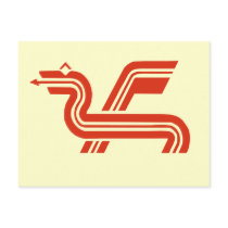
If you want to use the dragon as a symbol, we'd prefer Asian-style dragons. We would rather not use the actual plant snapdragon in our logo.
Some logos we like are:
- HSBC hexagon
[Login to view URL]
- Konami
[Login to view URL]
- Nikon
[Login to view URL]
Feedback will be given frequently in the Contest Discussion section below all submitted designs - please check those areas often!
In addition to the prize, the winning designer will be contacted for further design work. Thanks to all designers for your time and effort!
Our design will be used on
(Web) (Print Media) (Billboards & Signs)
Additional Info Added Jun 29, 2010
This is for our website: snapdragonapps.com
Note: We are NOT a game company - we make apps for our clients, which are businesses and non-profits. The logo needs to look professional. An simple symbol, or the letter "S" might be suitable.
Please don't include our slogan in the logo. Also, the "d" in Snapdragon is not capitalized.
Some logos with simple symbols that we like: